Alpers - Jannetta Residence

Paul Lukez Architecture
“I had my second home built,” says anesthesiologist Jim Alpers, “and it just happens to be attached to my first house.” What Alpers is saying, in jest, is that the vacation home of his and his family’s dreams (wife Carol Jannetta, M.D., and two sons, ages five and two) is the house they currently live in, in Dover, Massachussetts, about 25 miles west of Boston. The 3,100-square-foot house, designed by architect Paul Lukez, started out as a 1,600-square-foot, timber framed, 1960s Contemporary Cape. Sited on a hilly one-acre lot overlooking the Charles River, the house “wasn’t executed as elegantly as it could have been,” says Lukez. Though structurally sound, the original house was situated awkwardly, with the living room embedded in the center of the house, making the primary living space dark and uninviting. “It was hard to find the main entrance as well,” Lukez says. For Alpers and Jannetta, who do a lot of entertaining, the idea of recycling the bones of the original structure while totally reconfiguring the spaces and creating new ones sounded appealing and cost effective.


A year passed between design and construction while financing was secured.  The resulting two-story, 1,400-square-foot addition was lifted and attached to the completely renovated original house (Lukez says he kept about 75 percent of the existing structure). Along with the new living, dining, and breakfast rooms, the addition includes a cantilevered entry porte-cochere with parking, an entrance vestibule, a master bedroom suite, an office, and a ground-floor playroom.
Throughout the house, Lukez established a rhythm of awning and casement windows that filter natural light and frame vistas. “It was important that every space in the home feel both contained, yet connected to each other, and to the amazing views,” says Lukez. The effect was achieved not only with the windows, which activate the interiors by bringing the outside in, but also by creating a variety of ceiling heights with soffits, that help to delineate areas within the open-plan living, dining, and kitchen spaces. “The soffits are practical too, as they hide ductwork and mechanicals, and in the dining room, a major beam,” says Lukez. “Between the living and dining room the soffit helps with a spatial transition, and in the master bedroom it stiffens the corner, adding some extra structure there.”
Also in the master bedroom suite, the patterns continue with the geometry of the translucent, shoji-like closet doors, which run along the length of the suite. Made of glass covered by a white film, the pattern on the doors mimics the window placement and adds one more rhythmic element to the house.
Materials are rich and warm, including red birch floors and stair treads, walnut cabinets in the kitchen, cherry for a built-in sideboard in the dining room, and limestone in the master bath. “All the surfaces were chosen to bring another dimension of light, shadow, and reflection into the home,” says Lukez. A custom steel and glass stairway, located off the entrance vestibule and anchored to the back of the fireplace adds another reflective surface to the mix.
Alpers, who just returned from Ethiopia with his family and their newly adopted two-year-old, says he loves coming home to the house whether it’s back from a trip overseas, or just home from his easy commute to work. “I love to be cooking in this kitchen and to look over and watch the kids playing in the living room,” he says, trying to describe his favorite space in the house. “But then, I also like the master bathroom. Oh, and the living room is pretty nice. The truth is, we use all the space in this house. There’s nothing we would change.”

House in Kohoku


House in Kohoku
Yokohama, Japan
Torafu Architects

Shaped like a cluster of barnacles, the House in Kohoku doesn’t exactly blend in with its neighbors. Located in a hilly suburb of Yokohama, it has neither the conventional pitched roof nor the standard-issue wood frame. But contained within its reinforced concrete shell is a barrier-free home for a nautical architect and his wife who were ready to chart a new course.
Their children grown and gone, the couple no longer needed the two-story home they built 35 years ago on their flag-shaped property hemmed in by buildings. (“My parents inherited this land from my grandfather and built the old house,” explains the clients’ adult son. “But they wanted a new house to accommodate their lifestyle change.”) Not to mention, their old house had a number of shortcomings – it was cold, dark, and lacked adequate display space for the hundreds of dolls the wife collected while traveling the globe with her husband. So the clients decided to “scrap and build” and asked Torafu Architects to take the helm.
Nodding politely to the old house, the architects kept and reinstalled the original front door, an ornately carved wood panel that contrasts with the smooth concrete. It leads into the entry foyer, an auxiliary vestibule attached to the one room dwelling. Divided into quadrants, the home’s simple, square plan consists of four, distinct areas: kitchen, living room, bedroom, and bathroom topped by a loft that serves as a home office. Accessed by a ladder-like stair, the work area is as compact as a ship’s galley. “It expands the interior but it is an incredibly small space,” says the clients’ son, who ought to know since the loft is his graphic design office. An additional appendage at the rear holds storage and a walk-in closet.
The trick was how to distinguish the functional parts yet maintain the integrity of the whole. “Connected but separate, that’s the theme of this house,” explains Torafu principal Koichi Suzuno. Undifferentiated by full height partitions or the sliding screens commonly used in Japan, the floor plane unifies the house. But at the ceiling level, individual tubular roofs cap the quadrants and branch off in different directions. Topped with a skylight, each roof lets in a modicum of daylight, animating the interior with an ever-changing dance of shadow and sunshine while forging a direct link between interior and exterior.
Because of Kohoku’s densely-populated, terraced topography, this was no mean feat. Since the neighboring house to the north sits on higher ground, accessing the coveted southern exposure was a problem. Blocking sight lines from above necessitated the careful study of both skylight angles and roof shapes. At the same time, external considerations had to mesh with internal height requirements: while the kitchen’s roof had to be low enough to bounce reflected light onto the counters, the bathroom’s roof soars to 23-feet to accommodate the loft. “The volumes on top are definitely not residential in scale,” comments Suzuno.
Yet all four roofs converge at a single spot in the middle. Inside the house this center point is equally important. From here concrete wedges corresponding to the valleys between the roofs descend towards the perimeter walls. While their solid mass separates the quadrants, the slanted openings beneath preserve room-to-room continuity. Furniture placement and custom upholstery fabric underscore the divisions, but uniform interior finishes and the ubiquitous doll collection – thanks to built-in cabinetry they are visible throughout the house – pull it all together.


Seadrift Residence

Seadrift ResidencePhoto © Matthew Millman

Rate this project:
Based on what you have seen and read about this project, how would you grade it? Use the stars below to indicate your assessment, five stars being the highest rating.
Those of us from Northern California can attest to the fact that one of the most beautiful beaches in the world is located about 20 miles north of San Francisco—Stinson Beach. It’s a little wilder than most—windy and often foggy. It’s the kind of place where you want to have bonfires, or surf, or sit by the fireplace in your beach house with the floor-to-ceiling glass doors flung open wide, taking in the sights and sounds.
That’s almost what San Francisco-based architect Cass Calder Smith, AIA’s, client does when she’s at her home in Seadrift, the small community located at Stinson’s northern tip. Her house isn’t on the ocean, but at the mouth of Bolinas Lagoon. Still, the water is there, and it shimmers and laps—just a bit calmer than it might on Stinson Beach proper. And the Fireorb fireplace in the living room of her 1,900-square-foot beach house can be turned to face the deck or the sitting area inside. Smith, whose firm CCS Architecture is known for designing a number of San Francisco’s hottest dining spots, created the net-zero energy consumption house as a getaway to accommodate his client’s three-generation family. The client, who lives in San Francisco, bought the plot of land with its original house (according to Smith, “a tired little one-story built in the 60s that didn’t take advantage of the site”) in 2004, as a weekend retreat for herself and her two sons, both of whom live in the Bay Area and have small children. “What was great about this client was that she knew exactly what kind of house should be there,” says Smith. “She knew the potential of the site.” The site, with the lagoon on one side and views of Mount Tamalpais on the other, hardly needed to be ocean-side to make it worthy of a refined yet casual retreat.
The result of the client’s vision and architect’s hand does the site justice. Local building codes require new construction to be at least three feet above grade in anticipation of rising sea levels. Smith and his team approached the design by thinking of the project as one large dock, with a house in the middle. “Like a pier, the decks on the water side step down to the water with bleacher-like stairs,” says Smith. “My client’s family can sit on the steps and watch the water or the kids swimming. On the street side there’s another deck, and there’s no formal entry. This is a casual beach house. But the connection to the outdoors was crucial. You can see right through from the front to the back.” The glass fence around the lagoon-side deck amplifies connections to the water.
The house itself is an inverted, almost L shape, with public areas—kitchen, living, dining, on one side, and the bedroom wing on the other. Cedar siding treated with a bleaching oil clads the exterior, and the flat roof is rimmed in 316 stainless steel, a product that resists rust and is often used in marine building. Decks are Ipe.
The architect used durable, simple materials throughout the three-bedroom, two-bathroom house’s interior. “We tried to make it all functionally smart,” says Smith. Floors are concrete, the ceiling is paneled with cedar, and custom furnishings designed by CCS, such as walnut bookshelves, a white oak dining table, a white oak island with ample storage in the kitchen, and bunk beds in the kids’ bedroom add to the coherence of the house. Articulated skylights on both sides of the kitchen bring in patterned sunlight throughout the day. Storage areas under the waterside decks provide places to put beach gear and small boats.
On top of it all, the house has zero energy bills. An absence of air conditioning, photovoltaics on the roof that support the split-system heat pump and all electricity, two 4-foot by 8-foot hot water panels for the solar water system, and a xeriscaped landscape with deciduous trees support the Platinum rating, given by Marin County’s point-rating system, which is similar to LEED. Smith admits that it’s easier for a home that’s not used seven days a week to have no energy bills. “For a grid-tied house, every day you’re not there you feed more energy into the grid.” Smith’s clients use the house each weekend, so there are many days during the year to feed that hungry grid, and a lot of free energy ends up flowing back.


And speaking of getting energy back, Smith says he’s lucky enough to have a fairly open invitation to the house whenever he can take the time to enjoy it. “And they cook for me!” he says, modestly.

Island 254 C

Georgian Bay, Canada
Peter Hamilton Architects

Canadians refer to Georgian Bay as the sixth Great Lake. This appendage of Lake Huron is located almost due north of Toronto, and for many residents of that metropolis, Georgian Bay and its myriad small granite islands provide a summertime retreat. Modesty rules here, as many houses originally served as fishing huts and were hand-built.

“Hot water and a shower is heresy for Georgian Bay,” says one of the owners of an acre-and-a-half thimble known as Island 254c. For 40 years a small cottage stood in the center of this outcropping, hidden from the shoreline and its dramatic waterfront views to the west. Today it sports a pair of buildings designed by Toronto-based Peter Hamilton Architects that elegantly accommodates the owners’ getaway needs—including hot showers—without trumping the attitude or aesthetic of the region.


In profile, the five cedar-clad volumes that comprise the 2,000-square-foot main house may evoke the diagonal, shingled cottages of the Edward Larrabee Barnes–designed Haystack Mountain School of Crafts. The building also is reminiscent of low-slung houseboats or of 254c’s predecessor cottage, which was carefully dismantled and recycled. Another resemblance between old and new is more than skin deep: Never intended for wintertime occupancy, the new house, like the old one, foregoes insulation.
For Hamilton, however, the highly articulated main house represents not so much a reference to textbook or vernacular architecture history as a solution to a pressing riddle. The municipality in which Island 254c sits only allows construction of one building and one sleeping cabin on the property. (Boathouses are no longer permitted on the shoreline; 254c’s boathouse is grandfathered.)
Yet, without insulation, Hamilton explains, “you can hear through the walls. That’s why the sleeping cabins are connected at the corners. They appear separated without breaking the building code.” Like toy ducks connected on a string, the four sleeping cabins trail from the larger rectilinear volume that contains the kitchen and living and dining areas. Maple floors throughout were milled from century-old logs recovered from the bottom of Georgian Bay.
“You could have saved in the exterior envelope by making a single bar building,” Hamilton says, “but privacy and other livability issues would be compromised.” Constructing this illusion of a residential compound required no additional structural material, on the other hand. The sleeping cabins are built in a 16-inch balloon frame, while the public room features turned fir columns topped by steel moment connections bolted to timber beams and purlins. The entire structure is placed within a scoop of the glaciated rock that runs along a north-south axis, and is pinned to it for stability. Indeed, a recent tornado launched a nearby fishing cabin into the water, and there is a persistent wind that Hamilton hopes the homeowners will someday harvest with a windmill. 
Even without a full outfit of green accoutrements, the homeowners—a married couple with six children and three grandkids—say the year-old residence is “in sync with the environment,” as the wife puts it. “I want to feel like my house is a verandah. I want to be looking out on the water and hearing it and watching incredible storms,” she says. In a more tangible nod to sustainability, each corner of the main house has a rain chain feeding a cistern that irrigates the vegetable garden.
The parti accommodates the homeowners’ brood nicely, too. “Each family has its own unit, deck, and view this way,” the wife says of the seemingly mutually exclusive sleeping cabins. “You can get away from everybody if you need to. And when you want to be with people, there’s the main cabin. There’s lots of opportunity to interact.” Besides sacrificing frugality for the exterior envelope, Hamilton also notes that island construction comes at a premium—more than twice what it would cost to build on the mainland. And the homeowner acknowledges, “We had many slash-and-burn sessions” as a result. Even so, the highest compliment? She says, “There were tons of things we took out, but it would be hard for me to remember what they were.”

East Windsor Residence

East Windsor Residence

Austin, Texas
Alterstudio Architects, LLP
 
homas Fletcher, father of five, radiologist, and homeowner of a recently completed 4,200-square-foot house near downtown Austin, is sad. “It’s remorse,” he says of the absence of activity now that construction of his house is complete. “I can’t tell you how much I enjoyed taking part in the realization of this place. I never knew how much I’d miss the process when it was over.” Kevin Alter and Ernesto Cragnolino, principals of Austin-based Alterstudio Architects, deserve the credit for the three-year intellectual exercise that Fletcher had so much fun participating in.
In a neighborhood of early twentieth-century brick chateau-style residences, this house, modern and eye-catching with a base of black Leuders limestone and a broad ipe rain screen at its middle, stands out as what Alter calls “a beautiful object on a hill.” “Despite its four bedrooms, the three-story house is essentially a one-bedroom loft,” says Alter.
The focus may very well be on the top floor, which boasts 270-degree views and which contains the master suite, kitchen, and main living area. But the other two levels have plenty of their own assets. Those moments begin at the street, as you climb a gently rising path of concrete steps before coming to the over-scaled, pivoting glass front door that provides a fluid transition from rough limestone exterior to polished interior. Entering the house you face a stair with large ebonized oak treads hanging in a vertical space that connects all three stories. Past the stair, an etched glass wall reveals moving shadows from a stand of giant bamboo just outside, while a band of clear glass directs attention to a private garden. Rough shards of granite pass through the glass from outside to an interior granite fountain. Up the stairs to the second floor is a formal dining room (complete with catering kitchen and wine cellar), a guest suite at one end, and two bedrooms at the other (at least two of Fletcher’s five children stay with him much of the time). The rooms are well proportioned and have several eye-catching details (a punched window in one, an inverted one in another, built-ins including cabinetry and a bed in the guest suite), but the most notable feature has to be the rain screen. From the dining room, two 10-and-a-half-foot sections of the screen dramatically unfold to reveal some of the amazing views of Austin’s extensive greenbelt and the city beyond “This house is all about looking out,” says Alter, who took pains with the design to downplay the view to the west, with its unsightly power lines and neighboring houses above, and keep the focus on the northern, southern, and eastern views.
Up the stairs again and the third floor delivers the views, enhanced by an uninterrupted ceiling plane in the living area. The edge of the rain screen is apparent, as it rises 18 inches above the floor level “to give you a feeling of safety,” says Alter, “so you don’t feel like you’re going to fall out of the wall-to-ceiling windows.” Those same windows are accentuated by monolithic corner glazing. The west side of the third floor has a strategic pattern of porthole windows to illuminate the interior and contribute to the house’s texture palette with patterns of light and shadow that change through the day.
For Fletcher, who had never before lived in a modern house, living in his new home is wonderful—but not as wonderful as the excitement he felt being involved in its creation. As it evolved, architect and client met every week to discuss all aspects of the project. And while there’s some disagreement over who suggested the cherry picker to demonstrate the importance of building a three-story home, neither Alter nor Fletcher will deny the adrenaline rush they both felt throughout the whole design and construction process. Fletcher experienced so much joy, in fact, that apparently he is ready to put the house on the market and have another one built, with Alter as architect again. “I’m hooked,” he says.

Vashon Island Residence

For Seattle-based artist/designer Roy McMakin, simple things can be very complicated. And vice versa. Take, for example, the house his firm, Domestic Architecture, designed for a longtime friend: a music manager who spends one third of his time in Los Angeles, one third traveling, and one third escaping to his McMakin-designed retreat on Vashon Island, just a 20-minute ferry ride from Seattle. Seen from a distance, the house appears as a quaint farmhouse—a metal gable roof, board and batten siding, double hung windows—set on 13 acres of forest and pastures with views of Puget Sound. But come closer, and you understand why the homeowner says he lives “inside a sculpture” and why, for him, it is a place where personal history and love of art collide. As a dedicated collector of McMakin’s work (furniture and objects that turn nostalgia and domesticity on its head), he turned to his friend to help shape his memories—of the wild meadows of Northern California’s Marin County, where he grew up, as well as his grandmother’s farm in Iowa, where, as a child, he spent his summers—into what he calls “functional art.”
McMakin, who lives on Vashon Island, may not be an architect, but, says Domestic Architecture project architect Ian Butcher, AIA, “he knows architecture. He’s learned it.” According to McMakin, he and Butcher have a kind of “mind meld” going on after six years of working together, with McMakin as lead designer, taking abstract ideas about the familiar, the vernacular, and human perception, and subverting them. Butcher, in turn, articulates those ideas as drawings and then, as real buildings.
The program for this house called for two floors with an open, irregularly shaped living, kitchen, and dining area, a study, and three bedrooms, each with its own bath. The client also wanted a basement that could be accessed from both inside and outside the house, much like his grandmother’s home. He had admired a drawing from McMakin’s 2003 book of sketches of residential work that showed a barn-like structure with a row of uniformly spaced windows. Bringing that sketch to life for the client, McMakin and Butcher created a home with natural light in mind. “First, we oriented the main living spaces of the house toward the water, which is where the winter solstice sun sets,” says McMakin. “Then, we oriented the other side of the house for the summer solstice sun. Reconciling those two geometries gave us the crazy roof structure.” That crazy roof results from two volumes that collide at an obtuse angle, with adjoining walls either removed or made transparent with floor-to-ceiling glass, as well as a master suite that cantilevers out over a patio below. The sequenced windows that the client so admired are there—double-hung and regularly spaced regardless of what they run into, such as corners, cabinetry, or walls they must bend around. “The sequencing sets up an order and a logic,” says McMakin, “but that logic gets bent.” The whimsy continues with a third form, a concrete lean-to that functions as both entry and laundry room.
It’s a complicated house, in many respects, but it’s also a comfortable place to live. “Mostly,” says the owner, “it’s just my home. When I get on that ferry to go there, I feel the stress just melting away.”

Newsmaker: Jürgen Mayer H.

Jürgen Mayer H.
Photo © Oliver Helbig
When SFMOMA gave J. Mayer H. a show, the Berlin-based studio couldn’t have been expected to do anything tame. No framed drawings, no models here. After all, this is the firm that designed a Danish science museum in the shape of a hot rod flame, and stretched out an old German house like silly putty to make a new one. The buildings wouldn’t feel out of place in a Dr. Seuss book. So when J. Mayer H. designs a museum show—Patterns of Speculation: J. Mayer H., curated by Henry Urbach and up now through July 7—this is what you get: a web of thick stripes crawling over the ceiling and floor, video screens on leaning columns showing loops of the studio’s work, and in the background, a low, rumbling drone.
The inspiration was data protection patterns, those designs on the inside of security envelopes, and the soundtrack is one of those patterns, digitized and translated into audio. The show wraps you in data—an “information mist,” Jürgen Mayer H., the firm’s principal, calls it.
This is his first solo museum show, but the central conceit isn’t new. That mist—part high-tech wizardry, part gee-whiz playtime—hovers over all his work. Visitors to Stadt.House, a town hall in Stuttgart, walk through a computer-animated waterfall to get inside, and in 2005 they could leave their mark on Urbach’s New York gallery, which Mayer covered in heat-sensitive paint. Forget about a building’s “users.” To Mayer, they’re participants, acting with—or subject to—the architecture. From his office in Berlin, Mayer explained how he brought that idea to SFMOMA.
William Bostwick: Where did the idea for the show come from?
Jürgen Mayer H.: When Henry became curator [at SFMOMA], he talked to me. That was about two-and-a-half years ago. It was very informal, just going back and forth about the concept—how do you display architecture in a museum, and what new ways of displaying architecture can we use? We wanted an environment, an atmosphere, not just models and drawings in front of you.
WB: What’s wrong with models and drawings?
JMH: You remain an observer, and the sense of scale that’s so important with architecture is missing. You need imagination to see it. It’s like if you’re a composer, you can hear the notes you’re reading, but if you’re not trained as an architect, it would be hard to understand.
WB: So what did you do instead? What does your show look like?
JMH: We didn’t want just another white cube. There’s a super-graphic—a pattern enlarged to fill the space—and it’s continued on the floor and walls. So you’re enveloped in the structure. And it reaches out with fingers into the neighboring rooms. We broke the boundaries of a limited space. The space changes. The projections pulsate, and there’s a soundtrack in the background.
WB: What does it sound like?
Installation view of Patterns of Speculation: J. Mayer H. at SFMOMA through July 7.
Image courtesy SFMOMA
Installation view of Patterns of Speculation: J. Mayer H. at SFMOMA through July 7.

JMH: Like lions sitting in the corners, talking to each other. Very deep, bubbling, like rrrrrrrrrrrrrrr.
WB: Is the show a version of your architecture? What does it say about your work?
JMH: Well, there’s a certain idea about atmosphere—sound, smell, surfaces, media, different levels of information. And it’s important that you experience something. The show is about the different possibilities of how to experience space. It was very important that we made the show on a one-to-one scale. There are projections on the ceiling, on the walls. You can lean against one wall and look up, or stand back and see something else. You think about distances—how far back you need to go to focus on something—and how to translate that to larger buildings.
WB: Is architecture art?
JMH: That’s a question of reception, of the environment it’s presented in. But I’m not really interested in disciplines. Only when I’m asked these questions do I think about it. Personally, I don’t really care.

Newsmaker: David Dillard of Project Sleepover

Whether they’re for septuagenarians who can get around on their own or older people struggling with bed-confining illnesses, senior-living communities have surged in number in the past two decades, as the country’s retirement-age population has swelled.

Indeed, those aged 65 and older now represent 12.4 percent of the population, according to census figures, which is three times what it was at the turn of the last century. By 2050 that number will spike to 20.2 percent, the data show, and the supply of senior-living communities should continue to grow to match an increased demand, says Nancy Thompson, a spokeswoman for the American Association of Retired Persons.
As communities have grown more numerous, their looks, layouts and functions have fundamentally changed, too. Gone are long dim halls lined with drab identical units. Replacing them are cozy residential clusters, with rooms of varying sizes ringing a common area, creating an atmosphere that resembles a college dorm. The guiding principle today is to make these buildings feel less like a medical facility, and more like home.
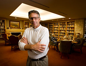
Dreaming up an innovative design, however, can be difficult after only a handful of typical client meetings. That’s why in 2002, the Village—a facility in Indianola, Iowa, run by Wesley Retirement Services—requested that David Dillard, AIA, the Dallas-based president of CSD Architects, spend a night inside to get a feel for the place.
He did, and in the disguise of a stroke victim: Dillard, who was 51 at the time, arrived by wheelchair, and refrained from using his right arm and leg for 24 hours.
That full-immersion, method-acting approach to mastering a subject worked. Dillard, who has been designing senior-living communities since the early 1990s, came away with a refreshed understanding of how these spaces function. Among them: orderlies can be noisy at night, so consider adding carpeting.
The learn-by-doing tactic incubated for a few years, but Dillard dusted it off this past May for a trip to Pilgrim Haven, a senior-living community in Los Altos, California, which he entered with earplugs, reading glasses, and taped-together fingers (to simulate arthritis), plus a wheelchair. It was so illuminating, Dillard is now requiring most of his firm’s 60 staff members, including non-designers like the chief financial officer, to go undercover and spend the night at a similar institution around the country. (After all, many employees have time on their hands because of the industry slowdown, he adds.)
On October 6, after the sleepovers end, the participants will present their results at a workshop at the firm’s headquarters in Baltimore. Meanwhile, in a sneak peek, Dillard explains his unconventional approach to RECORD.
C. J. Hughes: Tell us about the ground rules for your study.
DD: Eighty percent of us will be in skilled-care communities [for those in the last months of life]; the other 20 percent will be in assisted living [more mobile residents]. Independent living [nearly full mobility] is not the subject of the study because we feel we can design well without it.
There will be 40 sleepers on 40 campuses, and we are going for diverse geography and price points. Half of the communities are clients, half are people we don’t know. We will have different disabilities, whatever the directors decide, but none of the residents will be in on it. Oh, and some of us will try to escape.
CH: Why is immersion so much better? Wasn’t the old approach effective?
DD: Until you try to lean over and get something out of your suitcase, and it takes you not 20 seconds but seven minutes, you don’t appreciate the game of inches that seniors play. Good architects have good hearts and minds, but they haven’t been able to empathize enough with physical constraints. Before, we would walk through and listen to people, and then go draw, but what we have done now is gone an extra step, to live a day in the life and hope that this vicarious experience will make a notable difference.
CH: Was it emotional to be in that first sleepover, in Iowa?
DD: Well, during lunch, musical bands came in and asked if anybody wanted to play along. I’ve been playing guitar since I was 14, but I realized I was a stroke victim and couldn’t use my right arm. That hit me like a hammer to the heart, realizing I would never be able do that any more.
CH: What other lessons did you glean?
DD: There were these 80- or 90-year-old guys who liked to hang out with the young female caretakers, who sat at this pink-plastic laminated station in the center, in this area with no windows. There must have been 10 of them, mumbling and looking at their little girlfriends, in their imagination.  So, we redesigned that into a nice living space by relocating the station closer to windows, and then made another close by. That social factor was a big insight. There was also ramp in the middle that was too steep. I’m not a weak guy, but I had a heckuva of time getting up it. I had to get help. It was ridiculous.
CH: What are some issues topics you’re hoping your study tackles?
DD: I’m truly trying to find new things. There’s no coaching. I’m simply asking them to record their time, but I don’t want to lead the witness. I want them to be more objective than that. I’m deliberately being cautious about not pre-empting the results by publishing the results so far.
What is happening is that people live longer and die faster, so communities need fewer skill-care units and more independent-living ones, so adding those types is important.
CH: Is it possible that the staff will treat you differently, knowing who you really are?
DD: No. Obviously, visually we are different, but they are told this will only be valuable if they treat us like any other resident, to squint and fake it. Yes, they give us breath mints for pills, but we have to go through the processes. There shouldn’t be anything guest-like about this.
CH: Perhaps other projects could benefit from this kind of interactive analysis...
DD: Our education school guys are already on it. And the healthcare branch of architecture is better at evidence-based design than anybody else. They’re ahead of us, though I haven’t heard about anybody else doing this in senior living. But the education guys are promising to start their work as fake students. It has a pay-it-forward aspect that I find very gratifying.
CH: All the attention might help you get commissions. What would you say to people who call it a publicity stunt?
DD: This will give us a leg up, but it started as an internal self-improvement project for our firm. I’m really wrapping myself with a firewall, to focus on the academic part, so it doesn’t turn into a publicity stunt. It’s grown a lot, and I’ve gotten calls from friends I haven’t heard from in a while, but I don’t want it to be seen as gimmicky.
CH: You’re 58, close to retirement age. Has that stirred your interest? Will you move to a senior-living community? What kind?
DD: It will be 25 years before I go into a community, and I hope some bright young 58-year-old will do for me what I’m doing for 85-year-olds today. My forecast is the stigma of living in a nursing home will evaporate, thankfully, and we will see seniors living in much nicer accommodations, with wider bandwidths of ages and opportunities.
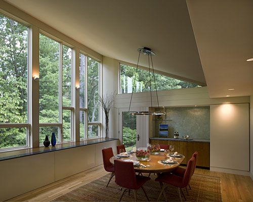
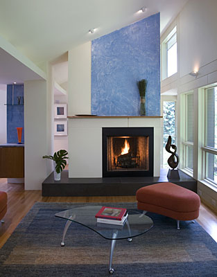
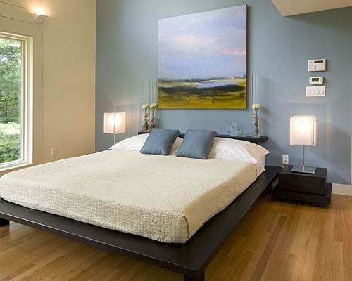
Newsmaker: Cameron Sinclair


Cameron Sinclair
Photo © Francine Daveta
Architecture for Humanity founder Cameron Sinclair celebrates the organization’s 10th anniversary this year.

When Cameron Sinclair co-founded Architecture for Humanity (AFH), the organization consisted of a Web site and two part-time volunteers. 10 years later, AFH has constructed an international network of 40,000 professionals committed to advancing and enabling humanitarian and socially conscious architecture, and, by its estimate, has been involved in building projects that have directly affected 700,000 people worldwide.
The social and professional networking capabilities of the Internet enabled this growth, allowing scores of local chapters to develop programs modeled on Sinclair’s initial project. Early on, Sinclair, who trained as an architect, decided to forego designing anything himself, but he has ended up building a system through which humanitarian architectural projects have multiplied.
In the past few years, this expansion has brought accolades and new responsibilities, and Sinclair and his colleagues are now regularly asked to participate in large-scale policy discussions with major organizations, including the United Nations.I spoke with him recently about these advancements, the organization’s implications for architects practicing in the developed world, and questions he has raised about ethics among architects at the top of the profession.
Aleksandr Bierig: Congratulations on 10 years.
Cameron Sinclair: Thank you. I think running an architectural non-profit is a bit like dog years. I know it’s 10, but it feels like 70 sometimes.
AB: Have you found that any of the organization’s initial ideals or missions have had to change as the size has increased?
CS: I think we originally started off with the idea of doing a few small projects, assuming that a small sustainable project could be a catalyst for a much greater change. As we grew, we realized that we weren’t a design non-profit, we were sort of a developer non-profit. We went from working on one project a year to working in multiple countries on multiple project-types simultaneously.
AB: And what does a client look for when they contact you?
CS: Well, it’s usually a very nervous moment in their lives because they realize that they’ve outgrown whatever space they’re in right now. But doing a building is actually extremely distracting for a charitable organization or a social entrepreneur who has very little time or risk to spend on it. Our role is to fill that void, to help at that moment when they’re moving to the next level.
AB: Are you generally working with designers from outside the area or local designers?
CS: Both. For us, the best scenario is when we marry an international designer who has the drive and passion to for a project with a local architect who has the skill set and license—we make sure that every project we build has a licensed architect on it.
AB: Can you give an example of someone from the outside coming in and developing something that local people maybe hadn’t considered?
Image courtesy Architecture for Humanity
Click the image above to view a slideshow of Architecture for Humanity projects. slideshow

CS: Absolutely. Susie Platt is an architect who’s now working with Richard Rogers. She was working in Sri Lanka with the United Nations Habitat and local federations to build a community center. While the building was traditional in its physical architecture, it integrated rainwater catchment systems to make sure that the water table wasn’t disturbed with an increase in population after the tsunami.
The siting of the building, natural ventilation, and rainwater systems were married with local materials, and it allowed the international architect a moment to play. Susie did an homage to Geoffrey Bawa’s idea of allowing landscape to enter a building, so there was this respectful marriage between Sri Lankan architecture and a low-tech, sustainable response from the newer western tradition.

Newsmaker Interview: Donald Albrecht


Donald Albrecht
Photo © Laurie Lambrecht
Donald Albrecht is the curator of architecture and design at the Museum of the City of New York. In recent years, he also has served as curator of the traveling exhibition Eero Saarinen: Shaping the Future, the first-ever retrospective of the influential Finnish-American architect.
The exhibition was prompted by the 2002 donation of the Eero Saarinen and Associates office archives to the Yale University School of Architecture. Since opening in Helsinki in the fall of 2006, the show has been presented in Oslo, Brussels, Cranbrook, Detroit, Washington, D.C., Minneapolis, and St. Louis. It lands in New York City this week, where it will be on display at the Museum of the City of New York through January 31, 2010.
The exhibition features never-before-viewed sketches, models, photographs, furnishings, and a specially commissioned documentary film. The retrospective has been seen as something of a comeback for Saarinen, who was arguably the most important architect in the U.S. (having designed iconic buildings for some of the most powerful corporations and clients of the time) when his career was cut short by his death in 1961 at the age of 51.
Organized by the Finnish Cultural Institute in New York, the Museum of Finnish Architecture in Helsinki, and the National Building Museum in Washington, D.C., with the support of the Yale University School of Architecture, the exhibition will make its final stop at Yale University in the spring.
Architectural Record recently spoke to Albrecht about the exhibition’s debut in New York City, home to several Saarinen landmarks.
Architectural Record: How did the exhibition come to the Museum of the City of New York?
Donald Albrecht: I work at the Museum of the City of New York three days a week, then I have other institutions I work for. This is an exhibition I was hired to do by the organizers. We were looking for a New York venue, so I proposed the Museum of the City of New York. It’s a bit of a weird situation: I’m basically installing my own show here.
AR: How is the exhibition in New York different from its other venues?
DA: We’ve enhanced certain components. Of course, when we were organizing the show, one option would have been to put all the New York projects together. But the show is organized by building type, so that would have gone against the organization. You find New York work in almost all the categories. Instead of pulling it out, we highlighted it in each of those sections.
We have a set of fantastic photographs by Robert Damora, who recently died. He worked closely with Florence Knoll, photographing interiors of Saarinen’s CBS Building [on 52nd Street]. We’re featuring six of those photos, which are unique to the New York venue. We also borrowed a model of the building from Kevin Roche [former principal design associate to Saarinen] that was not in the traveling show.
We have given a greater focus to Saarinen’s second wife, Aline, a New York Times art critic who went on to become a T.V. personality. She has the connection to the New York City media. Previously she weaved her way through the exhibit; now she’s featured in her own section.
We also increased coverage of Lincoln Center: Saarinen designed the Vivian Beaumont Theater with Gordon Bunshaft [of SOM, who designed the New York Public Library for the Performing Arts], and worked with theater designer Jo Mielziner to design its interior. The Museum of the City of New York Theater Collection has drawings of the project.
We added material on the TWA terminal. Peter Brandt was hired by Beyer Blinder Belle to photograph the terminal when it was closing, so we have a monitor showing these images. It provides a photographic essay of how the building looks today. You can see additions and levels of wear—photos that had not been taken before.
Another thing we did is group together the three New York area corporate campuses: the 1952 Time, Inc. Headquarters in Rye (that was never built), Bell Laboratories in Holmdel, New Jersey, and IBM in Yorktown Heights. You can say different things with the groupings of projects and objects. We can talk about Saarinen’s role in the migration of corporations out of the city.
AR: What were some of the challenges of curating the show in New York?
DA: At the Museum of the City of New York we have two galleries connected by a corridor, so we had to make the exhibition flow. Parsing it out to make it make sense was a challenge. Down the corridor we have the section on Aline. At end of corridor, we created an ante gallery—that you encounter before the big gallery—and devoted it to the TWA terminal. We located the New York projects at the access points and focal points.
AR: Your audience at the Museum of the City of New York is less focused on architecture than the other venues’ audiences. How did you deal with that?
DA: We have an audience that is interested in architecture, but not dedicated to it. In response, I’ve taken some photos out of show and made them into projections. Wendy Evans Joseph, the architect who designed the installation [Michael Bierut/Pentagram did the graphic design for the New York installation as well as the traveling exhibition], proposed a mini theater with a slide show of Saarinen’s work. I’ve focused the slide show on his interiors as a way of engaging a public that’s not used to seeing architectural work and working drawings. I added an experiential moment the other venues did not have.
AR: You co-edited the catalog with Eeva-Liisa Pelkonen, associate professor at the Yale School of Architecture. Tell us about that.
DA: We ended up working with lots of students from Yale. Much of the research done by scholars and students for the catalog was used in the exhibition. We used the book as the grounding for the show. We built up a biographical chronology of Saarinen’s life in the book, which was useful in terms of sorting out his life and inserting various aspects of it into the exhibition.
AR: What effect do you think this exhibition has had, or will have, on Saarinen’s legacy?
DA: It brings it back. And it opens up new questions about Saarinen, which is one of the goals of any scholarly enterprise. It is the first serious effort to catalog Saarinen’s work. And we tried to contextualize him through this documentary and interpretive exercise. In the exhibition we examine his engagement with the media, his relationship to theater design, and his relationship to his clients—the movers and shakers of the time. Henry Luce famously said, ‘whatever the end of the war produced, it would certainly be the American Century.’ Saarinen gives us an opportunity to look at the architecture of that time, because he is the architect of Luce’s American Century.
Dennis Findley, AIA
Image courtesy Dennis FindleyArchitects in the U.S. are not looked to for leadership the way they were in the early part of the 20th century or the way they still are in European countries,” says Dennis Findley, AIA
“.
If you follow the prevailing Washington metaphors, the United States sounds like a nation of frustrated drivers. We need a “road map” for everything from the Middle East to Afghanistan to health care. But to the McLean, Virginia, architect Dennis Findley, AIA, we’re actually more like clients with a tricky building project. Instead of a road map, he would like us to consider a napkin sketch.
“It’s that simple description that makes everything make sense,” he says of a quick drawing done on whatever paper is at hand. “It establishes the basis for executing anything from a small home renovation to a $50 million building on a difficult site.”
An alum of Harvard’s Graduate School of Design, Findley has a diverse portfolio that includes an Atlanta natural history museum and an embassy in Algeria. With napkins firmly in hand, he now is aiming to put his architecture skills to new use in Washington. He recently announced his bid for the Democratic nomination for Congress in Virginia’s 10th district.
If Findley, 51, wins, he won’t be the first architect to be seated in the House. New Hampshire Democrat Richard Swett served from 1991 to 1995, and there have been a few other candidates in recent years. Last February, a survey by the American Institute of Architects found that there are at least 850 architects in public service, acting as mayors, city council members, planning commissioners, and the like. In 2006, the AIA started its Citizen Architect program, which supports architects who would like to, or already do, serve in public office.
Though he has long been interested in the intersection of design and civics, Findley arrived at his current campaign in part via fatherhood. In 1995, when his twin boys were born, he decided that he would be the one to put his career on hold while his wife worked. When he discovered that one of the boys is developmentally delayed, three years became eleven. The couple found that their son’s education was governed by a tangle of laws, some of them contradictory and, they felt, ill conceived.
I recently spoke with Findley, who has since returned to practice as a senior project architect at Bowie Gridley Architects in Washington, DC, about his decision to run for office. Complex legislation, he says, requires clear plans, and architects, as quintessential problem solvers, are uniquely qualified to design them.
Lamar Clarkson: When exactly did you decide to run for office?
Dennis Findley: The seed was planted probably toward the tail end of my time in Cambridge. I read in the Boston Globe that there was a new high rise proposed right by South Station, and the mayor had already picked the color of the glass and was saying, “I want this to be this way, and I want that to be that way.” They were just bonehead decisions.
But that’s how things get done. I certainly didn’t like what was getting done, but it was my first realization that this [the political sphere versus the design process] is where a lot of things that affect people get done.
When I started staying home with my kids, I realized there are issues that affect families in really unintended ways. I started to realize the unintended consequences of laws. It was about two years ago that it really crystallized for me, and I made the decision last December to run, which began an intensive period of research and writing. Architecture magazines piled up on my desk unread.
LC: What do architects have to offer in Washington?
DF: We’re at the beginning of a tremendous period of change  in this country, and architects are on the front line. We have already been at the vanguard of the green-building movement, and the changes that are going to come—concerns about energy, the environment, planning patterns—are going to involve us directly. Architects in the U.S. are not looked to for leadership the way they were in the early part of the 20th century or the way they still are in European countries, for example. I hope our profession will seize this opportunity because our country needs us.
Architects have creative, solution-focused thinking, tremendous problem-solving ability, and a vision for seeing what can be. Not just for the problems I mentioned, but for issues from foreign policy to the national debt. It’s a way of thinking. 
LC: You have mentioned the idea of a napkin sketch as an ideal conceptual tool. Can you elaborate on that?
DF: I was trying to think about how people see architects and, specifically, moments when I have watched my clients experience a sort of revelation while thinking about a project. It has often been when I’ve grabbed that napkin or that envelope and sketched out the essential elements of a solution.
The debate going on now with health-care reform, for example, is so complex. The House bill alone is more than 1900 pages. We need to distill this very difficult thing down to its essence. What’s the essence of health-care reform? And that’s what architects are very good at—taking all these factors and understanding their implications.
Sometimes that means clearing the board of all the clutter. But you’re still informed by all that you’ve learned. When I was at the GSD, I remember Peter Eisenman said, “The best thing you can do is learn everything you can here and forget it when you leave.” There’s a little bit of truth in that. Be informed, fight, fail, win, have success, and then go out anew. Try to leave the baggage behind.
LC: What are you working on right now?
DF: I’m working on a new high school for Arlington County, Virginia, on the other side of the Potomac from Washington. The new Wakefield High School, at over 300,000 square feet, will replace an aging facility. The student body has a significant number of minorities and first-generation Americans, and its principal has made it one of the highest-achieving schools in the Washington area. 
It is being designed to receive LEED-Silver certification. The project is a great example of integration of green-building technology, and it is exciting to work with a community that takes the stewardship of the environment so seriously.
If this were to be my last project as an architect before taking public office, there could be no more fitting a send-off.

Newsmaker: Peter Morris


Peter MorrisImage courtesy Peter MorrisProponents of green buildings have a long list of persuasive arguments they can use to convince clients and developers that green is the way to go: Build green, and your employees will be healthier, happier, and more productive! Build green, and you will use less water and energy, benefit your local environment, and promote global environmental responsibility! Build green, and you will save money over the long term!
But with U.S. economy in shambles, the question looms: How will the recession affect the green-building market? RECORD put the question to Peter Morris, principal of the construction consultancy Davis Langdon. Morris heads up the firm’s research initiatives. 
Anya Kaplan-Seem: The economic recession we’re in is having a big impact on the building industry; what do you predict its effect will be on the green-building sector in particular?
Peter Morris: I would say there are two main threads here. The first is the short-term impact: How is the immediate effect of the markets going to change investment strategies? The second is how the current shift will affect long-term planning strategies. In the short term, I think that green will be impacted in much the same way that all investments are, which is to say that I don’t expect green buildings to be singled out for special treatment.
AKS: In the past it’s been possible to make the argument that an initial capital outlay for green features is economically worthwhile because it will save money and resources over time. Does that argument lose potency in a recession economy?
PM: Yes and no. If you can¹t invest in a premium product, you may make do with a product that's not as good. But I think that¹s going to be less of an issue both because the premium to go green is relatively small if present at all, and also because most building investors recognize that their investment choice is going to be around for an awfully long time.
If we buy the wrong TV we’re saddled with it for a few years. If we buy the wrong sandwich we’re only saddled with it for the afternoon. But if we buy the wrong building, we’re saddled with it for far longer. What’s happening now is that people are recognizing that building green creates long-term value, and that is a little different than long-term savings. It’s the equivalent of the old granite countertops—people can’t put a number on something like that, but they sense that it’ll help their resale value.

Newsmakers: Benjamin Godsill and Jiang Jun


Jiang Jun
Image courtesy of the New Museum
Urban China editor, Jiang Jun
Benjamin Godsill
Image courtesy of the New Museum
New Museum curator,Benjamin Godsill
 Cities are four-dimensional universes. Places and spaces at once, they’re always too big to fully grasp, and they’re always changing. If the contemporary apex of this incomprehensibility is anywhere, it’s in China, where cities are blurs of government control and ground-level commotion. They’re huge and sprawling, overpopulated, misunderstood, and growing fast. And a new show at the New Museum in New York packs all that into one room.
Jiang Jun edits the Shanghai-based magazine Urban China, and his publication is the material for an exhibition of the same name. Up through March 22nd, before traveling to Los Angeles and Chicago, Urban China: Informal Cities is a case study in problem solving.
How do you cover hundreds of Chinese cities in one magazine? And how do you fit four years and twenty-seven issues of that magazine into one room? For the exhibition, Jiang and New Museum curator Benjamin Godsill took the more-is-more approach.
The magazine is based on a huge database of information, images, and writing compiled by its editors, who then organize the information in different ways for each issue. (“Chinatown,” “Migrating China,” and “Urban Images andText” are a few previous themes.)
Filling the glass-walled fish-tank gallery at the back of the museum’s lobby, the show recreates the editorial process. Computers let visitors search the magazine’s full database, and excerpts from it line the walls. One surface is plastered with a collage of information—maps, blurbs, photos, even some physical objects—while text on the glass wall separating the gallery from the lobby offers some key organizing terms in an interconnected web.
Stand outside, and the glass overlay gives a semblance of order to the jumble of information, but step into the gallery, and abandon all clarity, ye who enter here. That’s the point though, Godsill and Jiang agree, as they walk me through the space.
William Bostwick: How do you make an exhibition out of a magazine?
Benjamin Godsill: Right, without it just being a library? Because it’s not just about the magazine—it’s about the very strange, somewhat rigorous, almost obtuse research methods that go into it. The things they study are weird things, they’re not traditional academic urban subjects. So to physicalize it, to make people feel as if they were walking into the pages, it would have to be disorienting—it’s legible in many different ways but never fully legible.
WB: That mimics a city too, right?
BG: In a sense I think of it [the exhibition] like a city: there are different neighborhoods in here. So it allows people to have a relationship with the space as you would with a city. It stretches out into the lobby a little bit, and the way the [museum] building works, the street leaks back in here. And I’m hoping the show will leak out into the city.
WB: Jun, how did the magazine start? What goals did you have at the beginning, and how does the exhibition match what the magazine is trying to do?
Jiang Jun: My first intention was to do a book. This was 2004, and we got a sponsor who wanted to do a magazine. His idea was for an academic magazine, but we wanted a magazine that would be on newsstands, not just in institutions.
Our goal was to make the magazine as similar to the city as possible. So it’s based on a database of information that goes in two directions: top-down and bottom-up. If we were going to be an academic magazine, it’d be totally top-down. We have a lot of magazines like that—in every province, every city, there’s a planning institute, and their magazines are packed with information and proposals, but they’re far away from the people.
We want to show real life. So one side of the database is totally official, and the other is totally informal. In the exhibition, on one side, you can only see a collage. On the other, it’s totally organized.
WB: What sort of informality are we talking about in the show’s subtitle?
JJ: There’s “Dirtitecture,” for example—architecture that’s changed by its environment—and then there are social products, products you can’t find a designer for, like the basketball bucket.
BG: The bucket [on view in the show] comes from a city where all they do is make sports balls. This was a castoff, and they repurposed it with some rivets and metal. Now it’s a water-carrying jug. The objects come out of a need and an availability, without anyone—like a designer—mediating.
WB: Does this compare to New York at all?
BG: Yeah, you see informalism in the United States. At the sadder end, when you see people taking detritus and making homes out of them to stay warm. But it can even be very small things: the way stores construct pipes to take air conditioning water out. It’s not always drastic, but people are always changing the cities they live in.
WB: What lessons should architects take away?
BG: Architecture can impose a grid but people never conform to that. They’re always breaking the rules. Whatever you think the program is, it’s probably not. You can never understand what will happen before it’s been built.

Newsmakers: Daniel Libeskind

When the last monograph surveying Daniel Libeskind’s work was published—some eight years ago—the New York architect was riding a wave of praise for his Jewish Museum in Berlin. The project had won him international renown, putting him in league with other architects at the top of the profession. But at the time, the museum was one of his few built works.
Since then, Libeskind has realized half a dozen more museum projects, as well as single and multi-family residences, commercial spaces, and even a shopping mall. His formally ambitious work has made him a favorite of clients looking for recognizable design. From critics, it has drawn a mix of admiration and vitriol that has placed him at the center of debates about the values and aesthetics of architecture in the first decade of the 21st century.
Counterpoint: Daniel Libeskind, a new volume published by Monacelli Press, carries the last monograph forward, chronicling 36 projects—15 built, 12 currently under construction, and 9 unbuilt. The work ranges from his early Felix Nussbaum Haus to a recently announced residential tower for Manhattan.
Like the shimmering crags of his Denver Art Museum jutting through the cityscape, the book does not sit demurely on the coffee table.  Bound in a reflective silver cover, it spells out a design philosophy in large type over roughly 400 pages.
Structured as a dialogue with critic Paul Goldberger—an extended conversation forms the introduction—the book prefaces each project with a left hand page, where questions about the work posed in a small font are answered with brief responses in big, angular letters. Each project then unfolds in a series of photographs, renderings, and plans.
I recently spoke with Libeskind about the monograph. Frenetic, but also reflective, he discussed similarities among the projects detailed in the book as well as the state of architecture at the time of its release.
William Hanley: Why did you structure the monograph as a dialogue?
Daniel Libeskind: Well, you know, monographs are really a bore, and I wanted something more interactive. It’s about a conversation. I’ve always considered architecture itself a means of communicating.
I also wanted to create a book that was very clear. It isn’t just a bunch of blurred Xeroxes and computer graphics—computer noise—which are very popular.
WH: What is contrapuntal about your work?
DL: I don’t work in a linear manner. I don’t start from A and go to B.
WH: As the book took shape, were you surprised by anything as you revisited your body of work?
DL: Inevitably. For example, it occurred to me that the shopping center in Switzerland has a lot of cultural ideas. It looks more like a museum than a shopping center. It tends to transform the idea that architecture is just an elitist thing for a particular civic benefit. All architecture is civic, and even if you do a private house, it’s all part of some public realm.
I also realized that there is a continuity in my work that goes beyond the programmatics of different projects. I didn’t calculate it, but when you look at the book, a certain kind of exuberance arises.
WH: Introducing the Imperial War Museum in Manchester, England, you address a question about the “familial relationship” among your projects, saying, “The true signature of a building is not a fashion or a style, but a character that resists appropriation.”
DL: Quite frankly nobody will copy the Jewish Museum. Nobody will copy the Denver Art Museum because they can’t. They are truly inventions that require a lot of commitment.
The signature is something authentic. It’s not something done just for commerce. It’s about research. It’s about belief, passion, intensity. It’s something that is the art of architecture.
WH: Some of the buildings in this monograph have come to characterize an era of large, highly visible projects that may disappear in the current economic climate. Do you think we will see fewer buildings with the scale of, say, the Denver Art Museum in a few years?
DL: I think that people will be more conscious and not build as much, but then it’s even more important—and I think clients are very savvy [about this] today—to invest in something that is value for money.  I think it’s not a coincidence that the Empire State Building got built in a difficult economic era.
WH: Do you think we will emerge from this recession with a changed sense of social or aesthetic priorities in architecture? Will constraint—to some extent—foster creativity?
DL: I think that constraint is something that I’ve always had and I’ve always admired. What would a poet do without rhyme and sound?
You have to pursue architecture whatever the external conditions are. Even if you can’t build it, you draw it, you investigate it. I think the great architects have always worked, whether they had jobs or not.

Newsmakers: Kevin Roche and Morrison Heckscher

Nearly two decades ago, the Metropolitan Museum of Art completed the 1970 master plan by Kevin Roche, FAIA, of Kevin Roche John Dinkeloo and Associates (KRJDA), for its building in New York City’s Central Park. Since then, the museum may not expand up or out on its site. Yet it continues to reconfigure interior spaces to accommodate changing curatorial needs and increased attendance. The latest installment in this ongoing process, the second phase of a three-part renovation of the museum’s American Wing, was unveiled on May 18 in a ribbon-cutting ceremony presided over by First Lady Michelle Obama.
This stage of the project—by Roche, with the assistance of Garry Leonard, AIA, a senior design associate at KRJDA, and managing partner James P. Owens, Jr., AIA, in close collaboration with the Met’s curatorial staff—focused on the wing’s historic period rooms and glass-enclosed Charles Engelhard Court. It has transformed the erstwhile garden atrium into an exhibition hall by removing planters and replacing a formerly sunken, mason granite floor with a level Jerusalem limestone surface for the installation of sculpture. A new mezzanine was added under the balcony on the Central Park side of the court to display decorative arts, and the ground beneath it was excavated to provide 9,500 square feet of much-needed service space. The period rooms, which span the 17th through the early 20th century, were revised and reorganized for better chronological order and a clearer historical narrative.
When it opened in 1924, the American Wing—designed by architect Grosvenor Atterbury—was a freestanding, three-story structure to the northwest of the Met’s main building. Set behind the facade of Martin E. Thompson’s 1824 U.S. Branch Bank, which was acquired by the museum in 1915 when the former Wall Street building was razed, the wing was created to show American decorative arts and design, and featured a group of period rooms that would grow to become the most comprehensive collection of its kind in the world. In 1980, Roche expanded the wing according to his master plan to include painting and sculpture, and incorporated it into the main body of the museum with the addition of the Engelhard Court. At that time, a number of structural problems became evident that haunt the building to this day, chief among them the fact that its floor levels are out of sync with the rest of the museum.
Before the opening of the refurbished galleries, I spoke with Roche and Morrison H. Heckscher, chairman of the American Wing, about some of the challenges, as well as the history and achievements, of this project, and the delicate balance between architecture and art that such a program entails.
Leslie Yudell: Could you talk about the controversy that surrounded the expansion of the American Wing into Central Park in 1980?
Morrison Heckscher: At that time, the principal goal was to get the building built. The project was very political; it involved major negotiation having to do with building in the park. The design went forward regardless of the merits.
Kevin Roche: We had a hard time getting the master plan approved because the community said we were encroaching on Central Park, but we were not. The museum had been deeded a large area of the park, to the north, south, and west, that was never built up. Actually, we didn’t build out to the deeded area; we occupied less than the allotted space and gave back territory. The real issue for the community was they didn’t want the museum to expand at all.
LY: When the Engelhard Court finally opened in 1980, it was praised for its lush garden interior, and it remained popular. Why did you redesign it?
MH: The environment for plants is different than that for art, and after 30 years of experience with the building, we concluded that we could not maintain the space as a greenhouse. This is an art museum: It’s more important to have the collections displayed properly. Sculpture and stained glass especially were not shown to best effect.
KR: The Engelhard Court was never envisioned to have sculpture; it was intended as a garden courtyard. The design goes back to the original concept for the master plan, which introduced a series of relaxing places in the museum where people could rest, which would serve as entry points to different collections. The idea was borrowed from the courtyard of the Isabella Stewart Gardner Museum in Boston [by Willard T. Sears, 1901]. But as the sculpture collection grew, and pieces were moved from other areas into the court, I said: If this is an exhibition space, why not take out the plantings, level the floor, and make it a sculpture gallery.